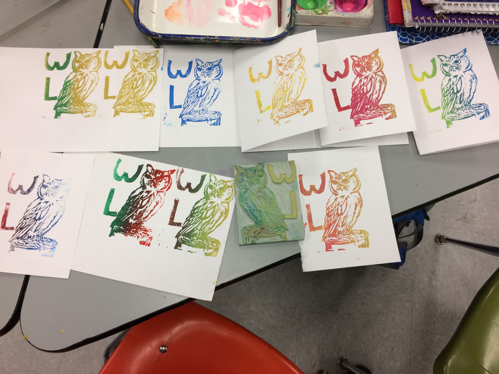
 This is my stap project. I did at least 10 color combinations my favorite is probably the all blue one. My art elements are probably color and form. My design elements are contrast and balance.
0 Comments
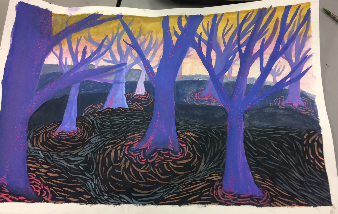
This is my tree painting. I used lighter purple in the background and darker in the foreground to show depth of field. I also used bright picks to go with the purple and blue as complementing colors. I used lots of space and value as art elements.
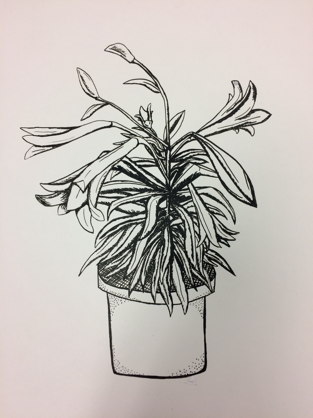 I drew a plant for my ink drawing. I used stippling, crosshatching and fine and bold lines to show value. I made the places with the most leaves more bold to create a shadow and the further out leaves more fine.
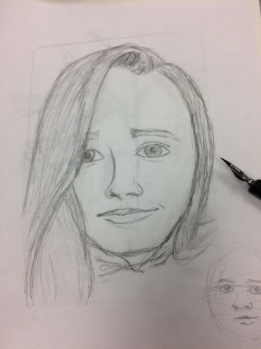 this is my forward portrait. I used light and dark lines to create value. I measured the space to make it look the the picture I was drawing. I tried to make high lights and darker places.
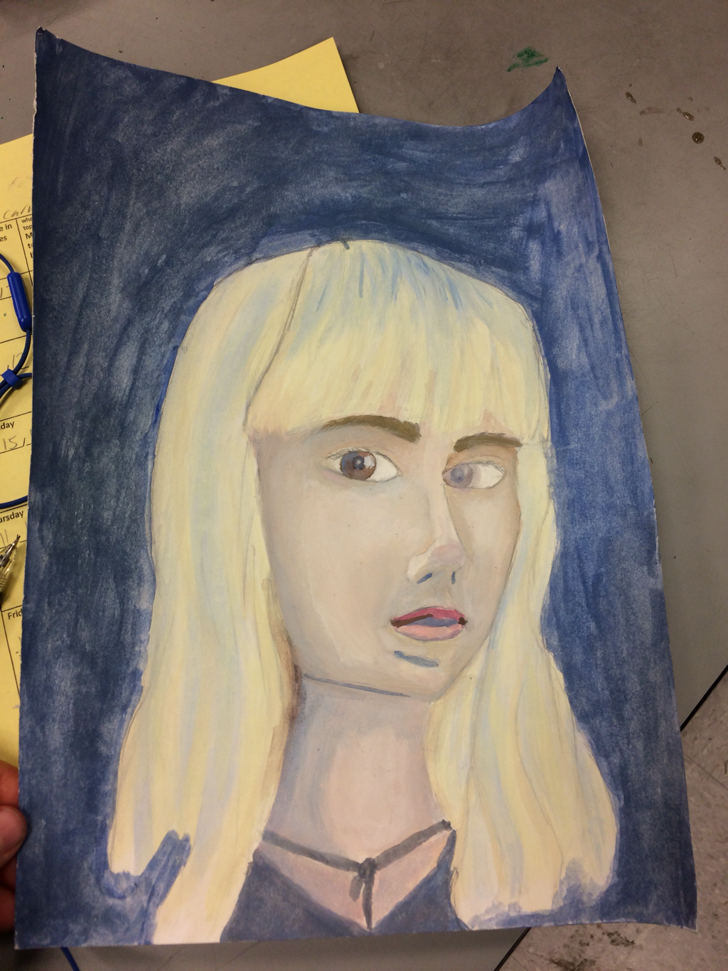 this is a portrait painting I did. The skill I used was paint and using light and dark paint st create highlights and shadows. My element was value. I made the background more of a dark blue to show the light and dark textures in the skin ton and hair.
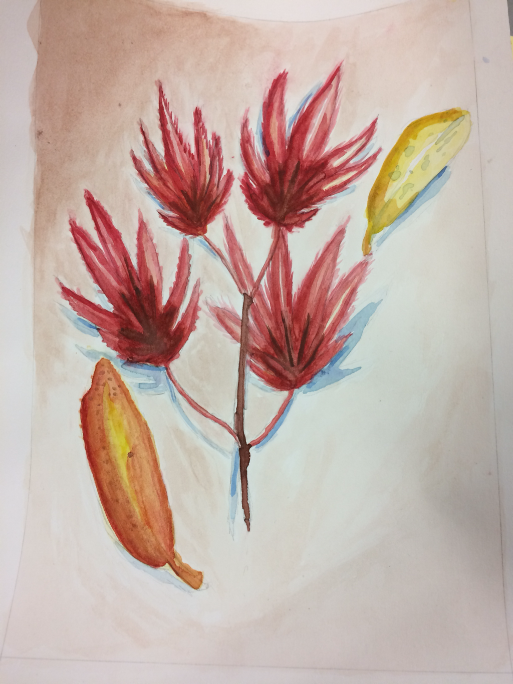 this is my leaf panting. A skill I learned was leaving the white to create a high light. The element would be color and not using black to make darker shades. In this drawing I tried to use darker shades of color to show what's farther away.
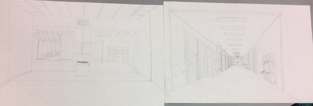
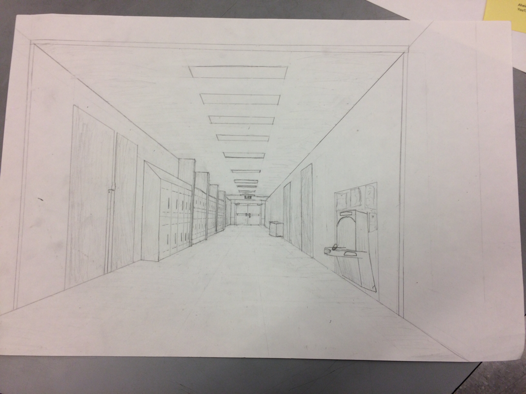
This is my hallway drawing. I made the back boor my "demention point". My skill that I used was one point demotion. The element is space and form. In this drawing I drew the hallway and used the demenion point to figure out where the lockers and doors are in the space.
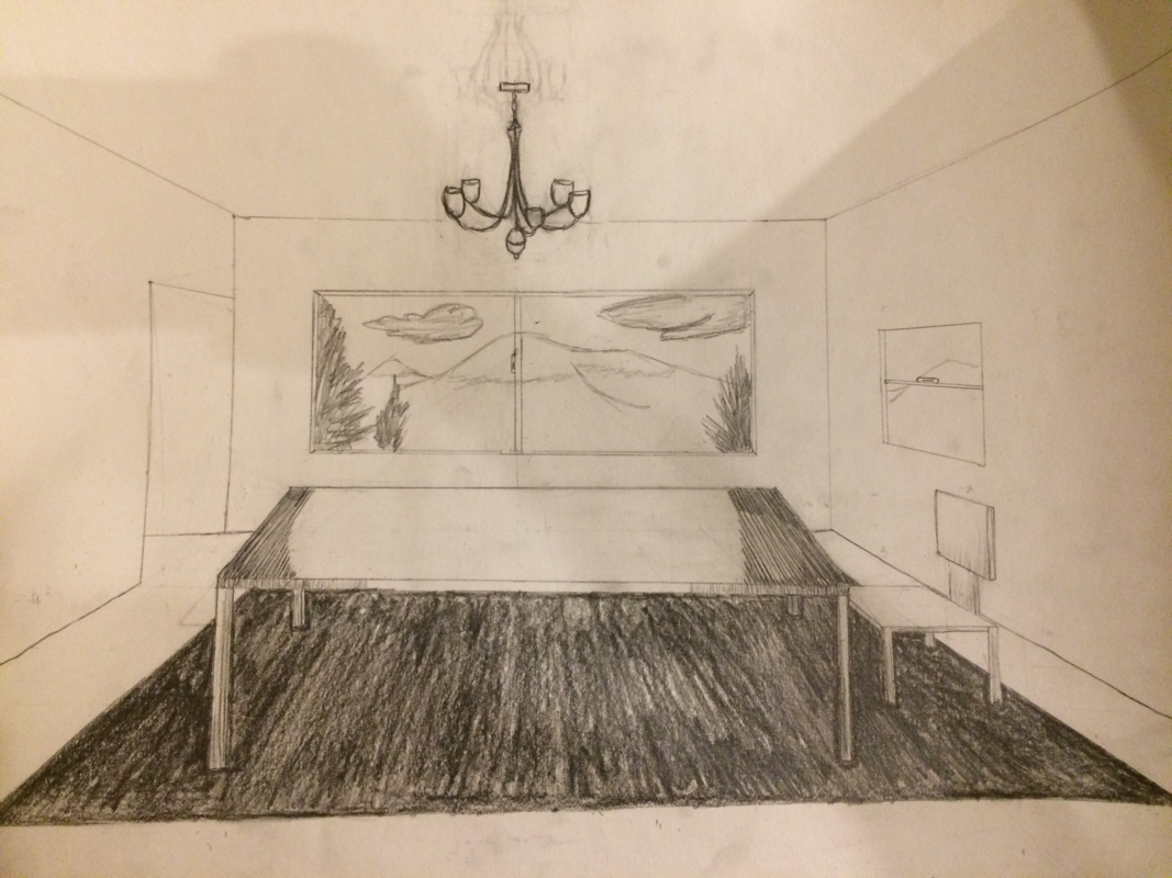
this is my room one Point prospective drawing. My skill used in this drawing is point prospective. A element I used is space. In this drawing I have a hallway to the left wall and a window on the right. The back wall also has a window and the ceiling has a light fixture. The ground has a rug, table, and chair this way every surface is covered with something.
this is my line object drawing. I used lines to show value. The darker lines should what's closer vs light lines being farther away.
this is my pepper drawing. i used lots of value using pastels. in this drawing i learned how to use light to dark values. 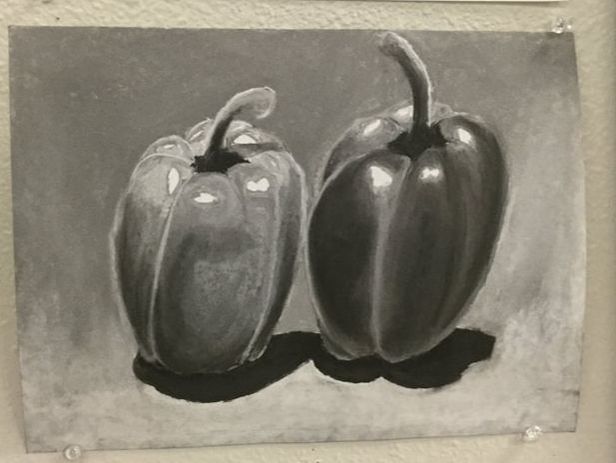 |
AuthorWrite something about yourself. No need to be fancy, just an overview. ArchivesCategories |
 RSS Feed
